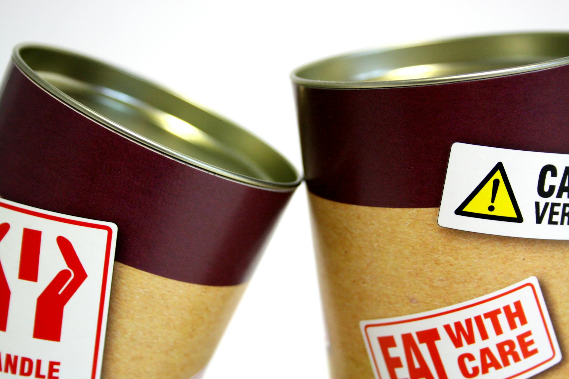
Clarity… accessibility… readability… do none of these words compute with food manufacturers and label designers? I am hesitant to use the word ‘designer’ here, as it implies that some thought has gone into label production, when I’m really not sure that it can have.

I have always been of the opinion that when you make products, environments and services accessible for disabled people, then the end result works so much better for everyone! So why, when shopping or eating out, do I continually have to reach for my phone to enlarge text on labels and menus to make it legible. Fortunately my eyesight has not been permanently impacted by my diabetes, but I am conscious that changes in blood sugar will always blur my vision, so I can imagine the challenge that poor and inconsiderate labelling causes to those whose vision has been damaged.
PLEASE, PLEASE, PLEASE can we just STOP being presented with white text on pretty candy blues and pinks, and even yellows… I simply cannot believe that this works for anyone! Labels provide useful nutritional and allergy information, which can for some people be essential for them to have to stay well and alive – we are not interested in design trends – we want the simple facts! There is plenty of guidance out there from various organisations, including that from the Food Standards Agency, the Interaction Design Foundation and the Design Council.
So, can I suggest that those responsible for any kind of signage and labelling go back to the drawing board and just keep in mind those of us who are trying to engage with the important information they are conveying – simple and accessible works for me, thanks…

Leave a comment